【必見】CSSだけで画像の縦横比を固定する方法
こんにちは、つばさです。
この記事は、

サイズの違う画像を並べたときに、同じ縦横比にしたい。どうすればいいんだろう。
こういった方向けです。
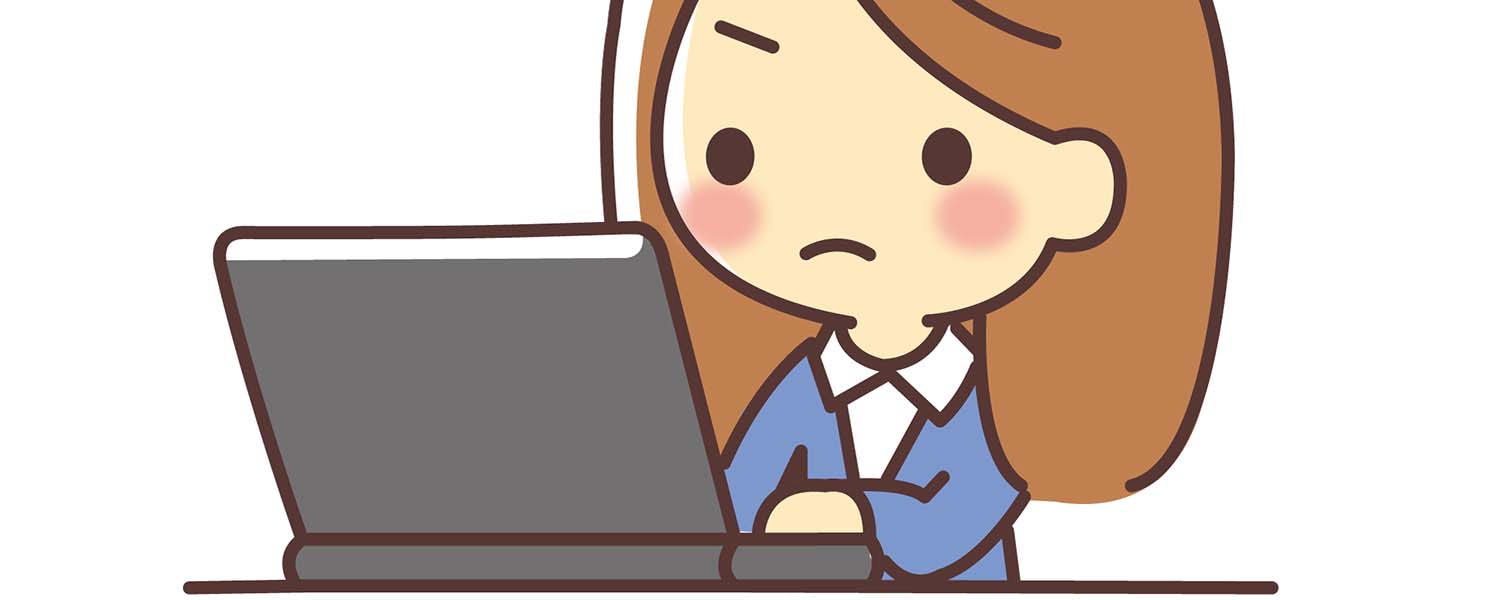
画像の縦横比が揃ってないとこうなります。
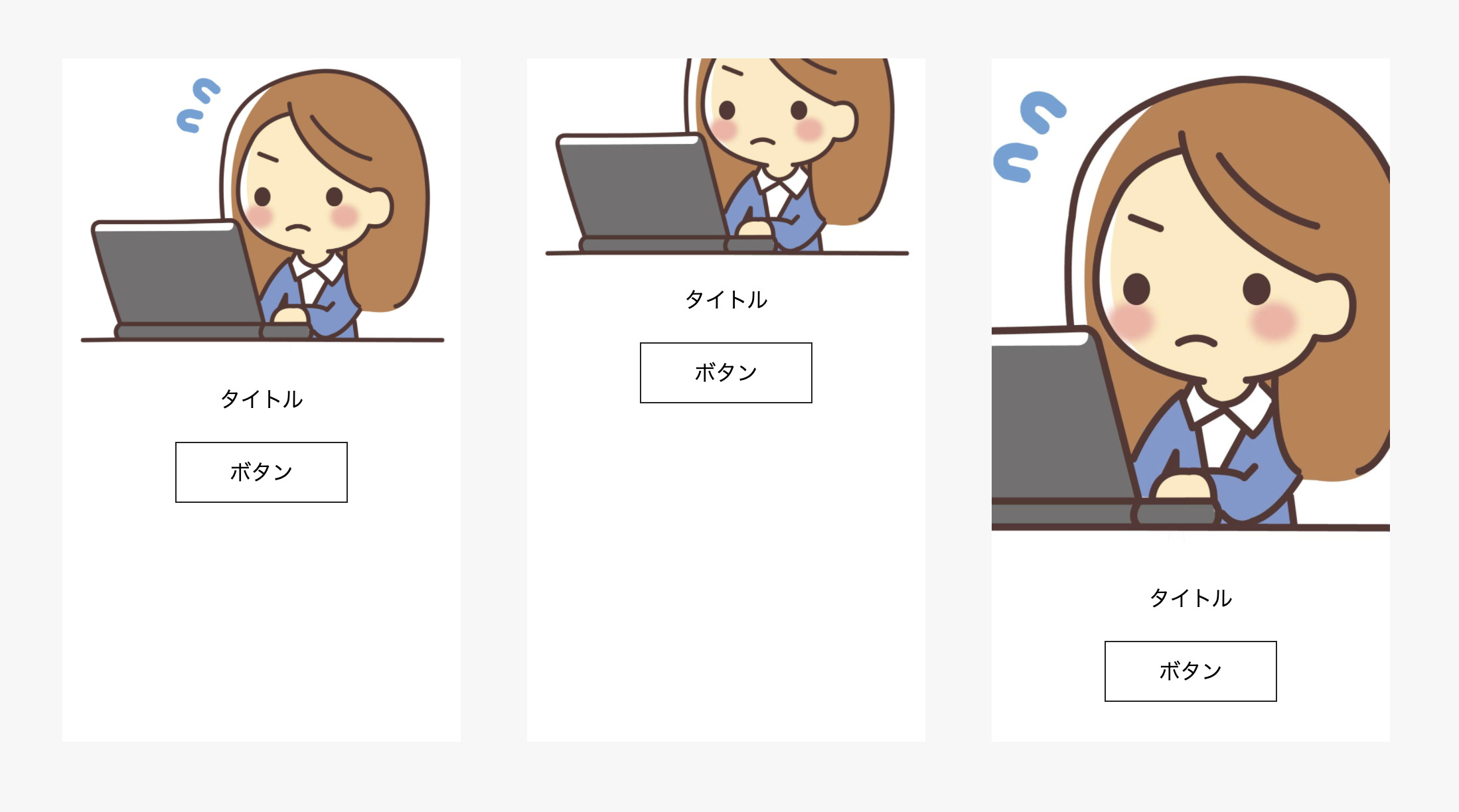
今回は2通りの方法で解説します。
CSSのみで、レスポンシブにも対応しています。
※IEは別の方法を考える必要があります。
方法①:画像をHTMLのimgタグで指定して縦横比を固定する方法
HTML
<figure class="item__figure">
  <img src="./assets/images/top/item01.jpg" alt="#" />
</figure>
imgをfigureで囲みます。divでもOKです。
CSS
.item__figure {
  width: 100%;
  position: relative;
  padding-top: ●●%;
}

.item__figure img {
  width: 100%;
  height: 100%;
  position: absolute;
  top: 0;
  object-fit: cover;
}
これで縦横比を固定できます。
案件ごとにpadding-top: ●●%;の●●部分を変えてください。
●●は画像のアスペクト比によって変わります。
アスペクト比の例
| アスペクト比 | パーセント |
| 4:3 | 75% |
| 3:2 | 66.666% |
| 2:1 | 50% |
今回は75%にしてみます。
不要かもですが、全体のHTMLとCSSも添付しておきます。
<ul class="items">
  <li class="item">
    <figure class="item__figure">
      <img src="./assets/images/top/item01.jpg" alt="#" />
    </figure>
    <p class="item__title">タイトル</p>
    <a class="item__button" href="#">ボタン</a>
  </li>
  <li class="item">
    <figure class="item__figure">
      <img src="./assets/images/top/item02.jpg" alt="#" />
    </figure>
    <p class="item__title">タイトル</p>
    <a class="item__button" href="#">ボタン</a>
  </li>
  <li class="item">
    <figure class="item__figure">
      <img src="./assets/images/top/item03.jpg" alt="#" />
    </figure>
    <p class="item__title">タイトル</p>
    <a class="item__button" href="#">ボタン</a>
  </li>
</ul>
.items {
display: flex;
justify-content: space-between;
}
.item {
width: 30%;
background: white;
text-align: center;
padding-bottom: 30px;
}
.item__title {
margin-top: 20px;
margin-bottom: 20px;
}
.item__figure {
width: 100%;
position: relative;
padding-top: 75%;
}
.item__figure img {
width: 100%;
height: 100%;
position: absolute;
top: 0;
object-fit: cover;
}
.item__button {
border: 1px solid #222;
display: inline-block;
padding: 10px 40px;
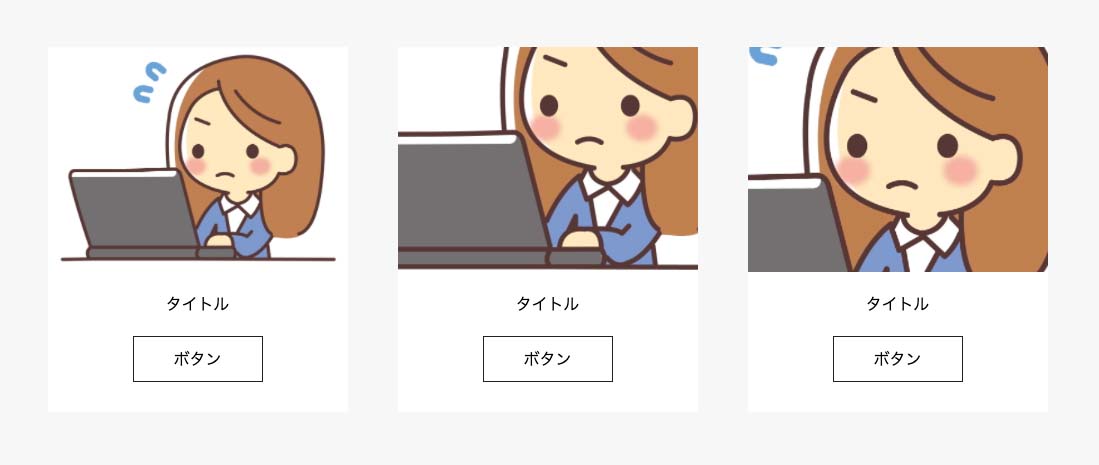
}方法②:画像をCSSのbackground-imageで指定して縦横比を固定する方法
HTML
<ul class="items">
  <li class="item">
    <div class="item__bg item__bg1"></div>
    <p class="item__title">タイトル</p>
    <a class="item__button" href="#">ボタン</a>
  </li>
  <li class="item">
    <div class="item__bg item__bg2"></div>
    <p class="item__title">タイトル</p>
    <a class="item__button" href="#">ボタン</a>
  </li>
  <li class="item">
    <div class="item__bg item__bg3"></div>
    <p class="item__title">タイトル</p>
    <a class="item__button" href="#">ボタン</a>
  </li>
</ul>
今回はCSSで画像のパスを指定します。先ほどみたいにfigure等で囲む必要もないです。
CSS
.item__bg {
  padding-top:●●%;
  background-size: cover;
  background-position: center;
  background-repeat: no-repeat;
}

.item__bg1 {
  background-image: url('../images/top/item01.jpg');
}

.item__bg2 {
  background-image: url('../images/top/item02.jpg');
}

.item__bg3 {
  background-image: url('../images/top/item03.jpg');
}今回も案件ごとに、padding-top: ●●%;の●●部分を変えてください。
同じように75%を指定すると完成です。
余談ですが、画像の縦横比が固定できるようになると、GoogleマップやYoutubeの埋め込みにも応用できます。ぜひ試してみてください。
念の為、全体のCSSも添付します。
.items {
  display: flex;
  justify-content: space-between;
}

.item {
  width: 30%;
  background: white;
  text-align: center;
  padding-bottom: 30px;
}

.item__title {
  margin-top: 20px;
  margin-bottom: 20px;
}

.item__button {
  border: 1px solid #222;
  display: inline-block;
  padding: 10px 40px;
}

.item__bg {
  padding-top:75%;
  background-size: cover;
  background-position: center;
  background-repeat: no-repeat;
}

.item__bg1 {
  background-image: url('../images/top/item01.jpg');
}

.item__bg2 {
  background-image: url('../images/top/item02.jpg');
}

.item__bg3 {
  background-image: url('../images/top/item03.jpg');
}
というわけで、今回は以上です。
HTMLとCSSを独学する方法は下記記事でまとめています。是非ご覧ください。
»【2021年最新】HTMLとCSSを独学するためのロードマップ
【2021年最新】HTMLとCSSを独学するためのロードマップ
HTMLとCSSの独学の進め方がわからない。独学で勉強して仕事をしていきたいけどやり方がわからない。そんなお悩みはありませんか?この記事では、月3〜5万円は稼げるげるようになるための独学の方法を解説しています。HTMLとCSSの学習の仕方がわからず悩んでいる方はぜひご覧ください。